Results 1 to 10 of 46
Like Tree4Likes

  Click here to go to the first staff post in this thread.   Thread: iOS app became ugly-looking too

Threaded View

Previous Post Previous Post   Next Post Next Post
  1. #36
    Addicted
    Join Date
    Oct 2018
    Posts
    692
    Quote Originally Posted by Sinany03 View Post
    *bump

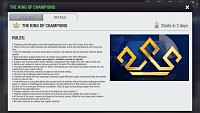
    I hope this issue is not forgotten now that everybody’s getting into the “spirit” of the 10th birthday celebrations. Otherwise I will need to use a magnifying glass on my phone to read the rules for the events

    Click image for larger version. 

Name:	5C995328-4BD7-4B35-81FA-33760D677B58.jpg 
Views:	20 
Size:	84.4 KB 
ID:	133238

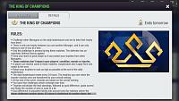
    OK, now this looks better:

    Click image for larger version. 

Name:	9A50CBE7-F44D-41DC-9C1E-0DF06E0AB04D.jpg 
Views:	11 
Size:	89.4 KB 
ID:	133321

    The disproportionate sizes in places like training screen or match summary still there, but that’s tolerable now. I just hope the issue of expanding green area in live match highlights is also fixed, that is the most annoying part about the display. We’ll see tomorrow when thesecond matches in Cup are played.
    Last edited by Sinany03; 05-04-2020 at 07:59 PM. Reason: spelling