Day 27 - Palace teams report.
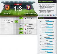
Palace Casuals played their last away match of the season at 10th place, and eventually overcame the home side to register a 3-1 win. Maarten Wiegman became Casuals' first '30 League goals in a season' player* with the first goal, and then provided two assists for the late goals scored by Lukas Lembacker and Angelo Musto.
*since detailed record-keeping started.
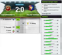
Palace Terriers played their third tie against a friend team in their Champions League Final and the quality gap showed, Terriers losing 0-2 in a tightly-contested match. Terriers always looked like getting back into the game after going one down early in the second half, but when Philip McKay transgressed in the penalty box and the spot kick was confidently put away by the opposition, the trophy slipped away.


 1267Likes
 LinkBack URL
 About LinkBacks



 and pay to win has become to dominante
 FireCats is testing level - 36 -


