At this very moment:
+ The new training looks good and appealing. It really adds something to work on when you don't have anything to do.
+ Visually ok
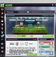
- Real time matches notification shows a manager picture, but no name or team name. It's not actually clear who's playing if you want to watch the game
- Referring to % instead of cones for quality may need some time to get used
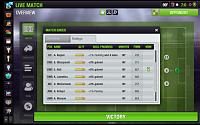
- Many details aren't easy to see at a quick glance like it was before, like morale, precise condition, SA
- Missing the option to take over a new club (where is it?)
- No more team history option and historic stats
- A real trophy room where you can see them all together and not only by season
- IMHO it doesn't fit on a desktop, it's ok on a touchscreen mobile, but not on PC
EDIT:
- Having the next upcoming match on top of the screen all the time was better than having to press home everytime
- Now you can't see how many days a player will be out for injury by just hovering on the injury icon. You have to click on the player and see.


 56Likes
 LinkBack URL
 About LinkBacks
 Reply With Quote


 or im missing something. Now you have to go to every single player to look at the skills and keeping track of their progress. In the old version you had the option to save up skill points in the new update you don't.

