View Poll Results: Do you like those white circles from the new Team's screen ?

Voters
40. You may not vote on this poll
  • No, I don't like them

    34 85.00%
  • Yes, they are useful

    6 15.00%
Results 1 to 10 of 28
Like Tree20Likes

Thread: Those white circles in the new team's screen

Hybrid View

Previous Post Previous Post   Next Post Next Post
  1. #1
    Dreamer meis's Avatar
    Join Date
    Dec 2012
    Posts
    324
    It looks even worse now........

    Previously, it was cleaner and more professional. The white bubble thingy serves no purpose.

    Wtf is the dev team thinking???

    It was nice to make the shirt smaller tho. The screen is less draggy. But the space between each players in the sub and reserve are widen.

    And I'm still waiting for the "save my previous formations".

    https://forum.topeleven.com/suggesti...ormations.html
    Last edited by meis; 02-19-2018 at 09:11 PM.

  2. #2
    Addicted
    Join Date
    Jan 2016
    Posts
    678
    The formation screen has a very poor design. It was bad, but now it is even worse. Take a look at these screenshots:
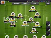
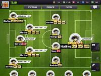
    Those white circles in the new team's screen-e49458c0-f99f-48f3-abb4-062e8ebbe74e.jpg
    Those white circles in the new team's screen-1d4e9f94-ae49-4763-8589-11407f23c642.jpg

    Now tell me:
    - What is my goalkeeper’s morale?
    - What is the name of my left most central defender?
    - What is the position of number 5: DMC or MC?
    - Since I play from left to right (first screenshot) why to I take corners from my own baseline (second screenshot)? What is left and what is right? In Dutch the terms are ‘links’ and ‘rechts’, just like German, but I see R and V. Please don’t tell me left and right are switched from both screens.
    - Why do I set the penalty and free kick takers at my own box area? Again: what is left and right?
    - What is the use of the four players at the midfield of the second screenshot?

    Attached Thumbnails Attached Thumbnails Those white circles in the new team's screen-e49458c0-f99f-48f3-abb4-062e8ebbe74e.jpg  

  3. #3
    Apprentice John Grant's Avatar
    Join Date
    Jan 2018
    Posts
    190
    Quote Originally Posted by Guido van den Berg View Post
    The formation screen has a very poor design. It was bad, but now it is even worse. Take a look at these screenshots:

    Click image for larger version. 

Name:	E49458C0-F99F-48F3-ABB4-062E8EBBE74E.jpg 
Views:	48 
Size:	93.3 KB 
ID:	95423
    Click image for larger version. 

Name:	1D4E9F94-AE49-4763-8589-11407F23C642.jpg 
Views:	48 
Size:	94.6 KB 
ID:	95425

    Now tell me:
    - What is my goalkeeper’s morale?
    - What is the name of my left most central defender?
    - What is the position of number 5: DMC or MC?
    - Since I play from left to right (first screenshot) why to I take corners from my own baseline (second screenshot)? What is left and what is right? In Dutch the terms are ‘links’ and ‘rechts’, just like German, but I see R and V. Please don’t tell me left and right are switched from both screens.
    - Why do I set the penalty and free kick takers at my own box area? Again: what is left and right?
    - What is the use of the four players at the midfield of the second screenshot?
    I dont know what you have done , I suspect you set it up too look bad , but my screens are okay same as they were , positionwise, before the update.

  4. #4
    Addicted
    Join Date
    Jan 2016
    Posts
    678
    Quote Originally Posted by John Grant View Post
    I dont know what you have done , I suspect you set it up too look bad , but my screens are okay same as they were , positionwise, before the update.
    I’m afraid I did not. It’s my regular formation. Actually, the picture on my iPad looks ok compared to my iPhone. See the screenshot below.


    Verzonden vanaf mijn iPhone met Tapatalk