Page 5 of 5 FirstFirst ... 345
Results 41 to 46 of 46
Like Tree4Likes

  Click here to go to the first staff post in this thread.   Thread: iOS app became ugly-looking too

  1. #41
    Rookie
    Join Date
    Jan 2018
    Posts
    144
    Quote Originally Posted by SausyFC View Post
    Thanks for the update. Can you please send me a screenshot of your player positioning and when this happens after the update, along with which specific iPad you're using? This will help me reproduce the issue for the team.
    Hi Saucy, I am also seeing this problem on an iPad. On my android phone placement of players works well. However, when I move to an iPad (iPad pro 2nd gen) the players do not get placed where I move them but hop around somewhat. This has been like this for the past few weeks and remains like this even after the latest update - which for the most part looks much better than the last one.

    Thanks for your help

  2. #42
    Addicted
    Join Date
    Oct 2018
    Posts
    692
    *bump

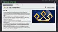
    I hope this issue is not forgotten now that everybody’s getting into the “spirit” of the 10th birthday celebrations. Otherwise I will need to use a magnifying glass on my phone to read the rules for the events

    iOS app became ugly-looking too-5c995328-4bd7-4b35-81fa-33760d677b58.jpg

  3. #43
    Newbie
    Join Date
    Nov 2015
    Posts
    11
    I have the same issue on iPad, details seem super imposed for size of the screen plus what’s really pissing me off is when I move players around in their positions they just bounce around all over the place and don’t stay in the position I want them in 😡😡😡😡😡

  4. #44
    Newbie
    Join Date
    Apr 2019
    Posts
    2
    I was happy that they cancelled the previous version, but now everything is again very small and you can hardly read it.
    Not everybody has or want a very big phone. Probably they only think about the people who can spend the most money on this game.
    I went back to an older version for the moment and hope they will fix this.

  5. #45
    Addicted
    Join Date
    Oct 2018
    Posts
    692
    Quote Originally Posted by Sinany03 View Post
    *bump

    I hope this issue is not forgotten now that everybody’s getting into the “spirit” of the 10th birthday celebrations. Otherwise I will need to use a magnifying glass on my phone to read the rules for the events

    Click image for larger version. 

Name:	5C995328-4BD7-4B35-81FA-33760D677B58.jpg 
Views:	20 
Size:	84.4 KB 
ID:	133238

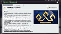
    OK, now this looks better:

    iOS app became ugly-looking too-9a50cbe7-f44d-41dc-9c1e-0df06e0ab04d.jpg

    The disproportionate sizes in places like training screen or match summary still there, but that’s tolerable now. I just hope the issue of expanding green area in live match highlights is also fixed, that is the most annoying part about the display. We’ll see tomorrow when thesecond matches in Cup are played.
    Last edited by Sinany03; 05-04-2020 at 08:59 PM. Reason: spelling

  6. #46
    Addicted
    Join Date
    Jan 2016
    Posts
    671
    Quote Originally Posted by julien12 View Post
    Hi Saucy, I am also seeing this problem on an iPad. On my android phone placement of players works well. However, when I move to an iPad (iPad pro 2nd gen) the players do not get placed where I move them but hop around somewhat. This has been like this for the past few weeks and remains like this even after the latest update - which for the most part looks much better than the last one.

    Thanks for your help
    Bug is fixed in the 10.0 version.

Page 5 of 5 FirstFirst ... 345