Results 1 to 7 of 7
Like Tree5Likes
  • 3 Post By khris
  • 1 Post By Ursd
  • 1 Post By IImaestroII

Thread: Re-design - simple positional screen and a more tactical screen

  1. #1
    Spanish Forum Moderator khris's Avatar
    Join Date
    Jun 2013
    Posts
    16,330

    Re-design - simple positional screen and a more tactical screen

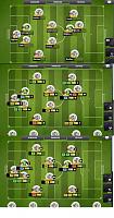
    I've added this in the yesterday's update thread but prefer to hear some opinions here, basically I moved some info's displayed of screen with the idea to make it less heavy, and have a 1st screen, with the stars + cards + triangles and the complete names, moved the positions from that screen to the 2nd one, that, don't have the names, so is more tactical, to have the positions info', condition, and morale, that in the 3rd pic is moved as a arrow right positioned.

    Too I would change this cold black for a translucid friendly colour tbh.
    The truth is that I see the players better positioned with the circles, but there's too much info in both screens and imo needs to be slightly reallocated.
    So a 1st basic and simple positional screen and one more detailed I think that can work better.
    ?

    The game has been always known for the simplicity in all the aspects, so this helps to keep the essence.

    Re-design - simple positional screen  and a more tactical screen-variants.jpg

  2. #2
    Dreamer Ursd's Avatar
    Join Date
    Dec 2017
    Location
    Spain
    Posts
    349
    I agree. Great work with the images!
    khris likes this.
    CD Rocket - Team showcase
    Stadium: Estadio Cabo Cañaveral

    League Champion: 4 [3, 4, 5, 6] --- League Runner's up: 0 --- League 3rd place: 1 [2]
    Cup Champion: 1 [6] --- Cup Runner's up: 0 --- Cup 3rd place: 2 [2, 5]
    Champions League Champion: 0 --- Champions League Runner's up: 2 [2, 3] --- Champions League 3rd place: 1 [5]
    Super League Champion: 0 --- Super League Runner's up: 0 --- Super League 3rd place: 0

    Triplets: 0

    Current Season: 7 --- Level 7

  3. #3
    Addicted IImaestroII's Avatar
    Join Date
    Jul 2017
    Posts
    506
    3 Simple things( To Nordeus ):

    - Remove that useless circle
    - Remove the positions...we all know our players, and leave the condition and morale
    - Add the oppo team shadow formation

    i think this is enough, btw gj Khris
    khris likes this.

  4. #4
    Spanish Forum Moderator khris's Avatar
    Join Date
    Jun 2013
    Posts
    16,330
    Thanks, amazing how many art can be created with 4 minutes of paint lol

  5. #5
    Addicted Temidayo_'s Avatar
    Join Date
    Mar 2016
    Posts
    558
    Not making the update because I'm unwilling to blind myself.

  6. #6
    Newbie
    Join Date
    Feb 2018
    Posts
    42
    I agree with you and i think also the most of the peoples.
    But i want to add something about subs. Smaller icons for them and in one lane.

  7. #7
    Famous KenoticFC's Avatar
    Join Date
    Dec 2016
    Posts
    1,290
    I didn't like the fact that the seven subs dont fit on the screen like they used. the last one is under and the fact that the nr of subs has not increased means that there is all that unused unnecessary space.